
Wednesday, December 11, 2013
Wednesday, November 27, 2013


Wednesday, October 30, 2013

Wednesday, October 2, 2013
New logo
I made "You tube" new logo. My new logo is shorter than the original one. I keep the same color combination, black and bright red. I played with the "tube" part. I intended to make some tube by using alphabet "u" from "You" but it ended up the shape of coffee cup. I still insist that the beginning shape red 't' and part of 'u' which is black looks like tube. I put the color unbalanced to feel something moving, active. I also put the triangle shape, the symbol mark of "You tube", in the negative space by combining "b" and "e" at the end of my new logo. I thought that the taking 'U' from 'You' would make "Yo" and it would make my new logo more enegetic. However, there is some 'y' symbols such as "Yahoo" or "Y"tv so I did not paly with that "Yo" part that much to look something active. Instead I just leave it the way the original logo was. I made 'o' smaller for its balance. 
Wednesday, September 25, 2013
Logos
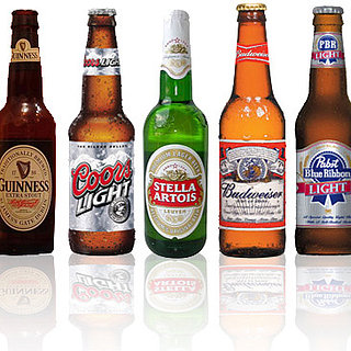
I go those two website a lot which seems everybody does. I am OK with their logos but If I have to work with logos I want to work on one of them because those are the ones I face a lot. (I go to Google a lot too but I don't want to work on it. I don't know why)
Wednesday, September 18, 2013


Wednesday, September 11, 2013


Wednesday, September 4, 2013
Name: Jieun Kim
Email: Kimj9521n@gmail.com
Major: Photography
What is your computer experience: word, photoshop
Do you have experience with Adobe Photoshop or Adobe Illustrator? (None, beginner, intermediate, advanced...etc.) Please be specific: I have experience with Adobe Photoshop through Photography class but I am a beginner.
What do you hope to learn from taking this class? Good skill for Adobe Photoshop program, artistic sense and current issue.
I have read and understand the course policies outlined in the syllabus for this class. (sign by typing your name and the date below): Jieun Kim 9.4.2013
Subscribe to:
Comments (Atom)